
Differences in circumstances mean that we were never really in this together, either here or internationally. But just because the number of people needing help is so immense, that is no reason not to try.
Month: May 2020
Covid-19 Update
I’ve done a slight update on my previous graph to add the max and min number of weekly deaths over the previous five years (dotted grey lines). The idea is to provide some idea of the typical range of deaths in a given week. (The range between the mean and the max and min is not symmetrical because I’ve used raw figures rather than standard deviations.)
If you take the difference between the 2020 weekly deaths and the max of the corresponding week in the previous five years, then the number of excess deaths is reduced from about 46,500 to more like 40,200, which is still about 61% higher than was reported at the time, although not as high as the 86% that you get when you use the five year average as your benchmark. I think the 61% figure is extremely unlikely as 2020 was actually running below the average until the outbreak of the pandemic, but still, it gives some indication of the likely range and uncertainty in the figures.
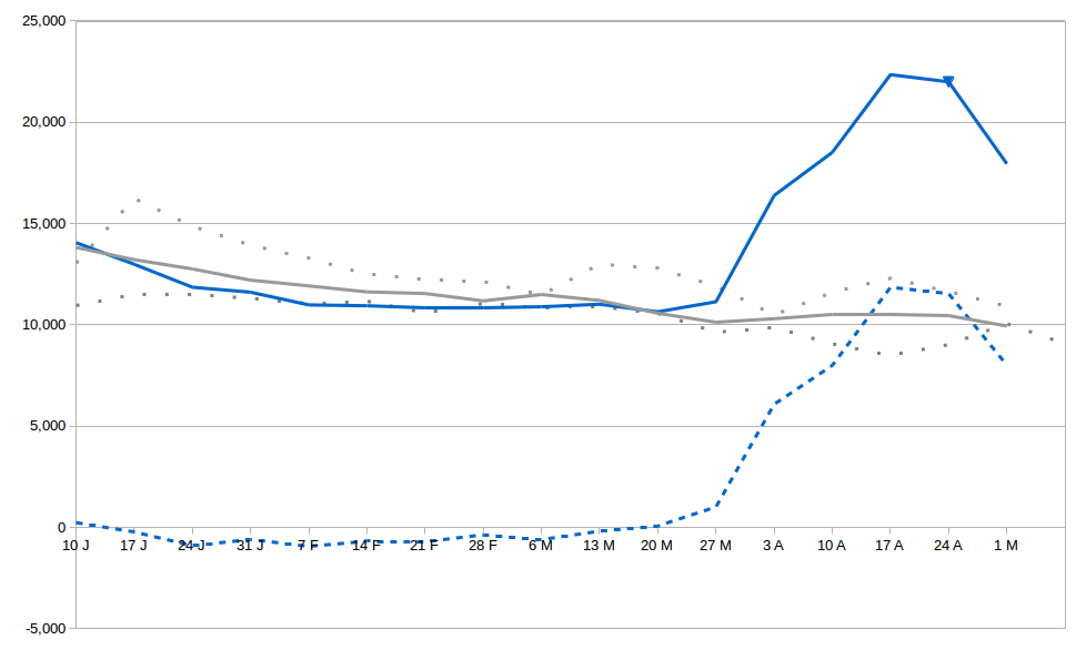
The solid blue line is actual number of weekly deaths in 2020 in England and Wales.
The solid grey line is the 5 year average.
The dotted grey lines are the max and min from the same week in the previous 5 years.
The dotted blue line is the difference between the 2020 figure and 5 year average.
Amazingly Reverend Doctor David Walker, Bishop of Manchester
And in the Big News today from a Faith Perspective, the 18th century and a TV series, both of which said the world was deterministic. They were both really good but wrong. I am right, and you can trust me because I’m a bishop. The Invisible Magic Friend gave us free will and so the world cannot be deterministic. Science is wrong and religion is right once again. Religion is just so useful.
Weekly covid-19 Update
This is my weekly reminder of the true level of deaths in the UK from covid-19, based on figures from the Office of National Statistics. The good news is that the peak of the outbreak is clearly past. The bad news is that the number of deaths are still much larger than being reported in the daily figures, even with the newly included care home deaths.
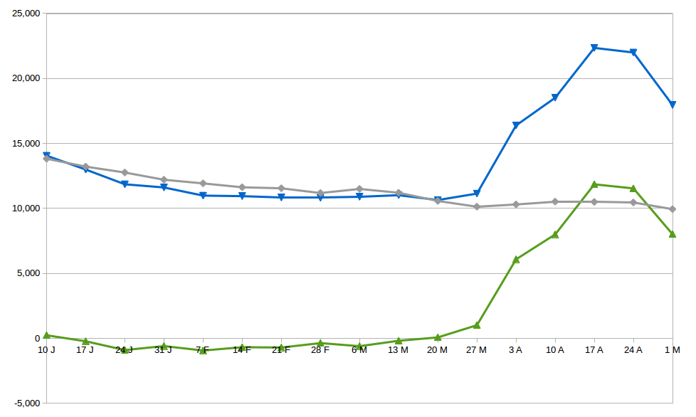
The grey (middle) line shows the average number of deaths for each week, averaged over the last five years. The blue (upper) line shows the actual number of deaths this year, and the green (lower) line shows the difference.
Since the outbreak began, there were about 46,500 excess deaths. Adding 10% for Scotland and NI brings this to about 51,200. The cumulative number of covid-19 deaths reported on that date was 27,510. The actual number of deaths was therefore about 86% higher than reported.
Last week’s figures were 80% higher than previously reported, so the daily reporting has actually managed to get worse, despite widening the inclusion criteria.
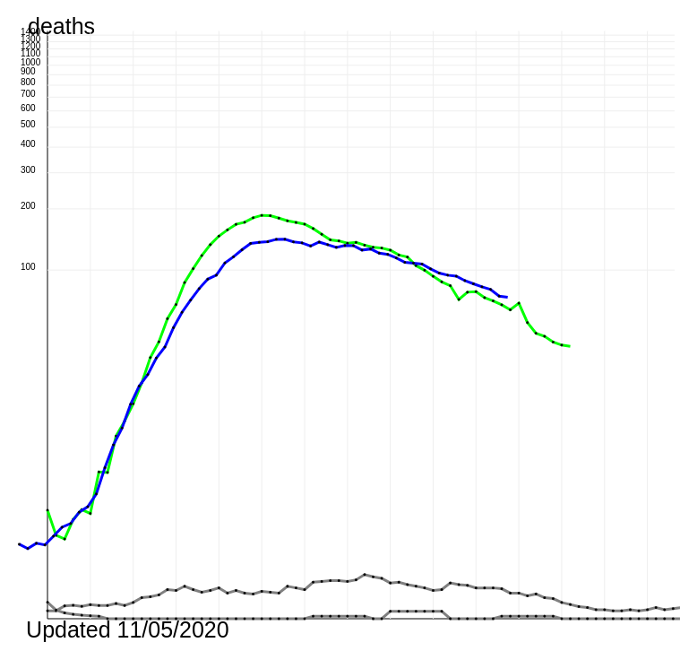
Here’s a quick comparison of the UK (blue) against Spain (green), with daily number of deaths per 10 million population. And a reminder of how Taiwan and South Korea have faired (both grey).
Fantastically Reverend Sarah Mullally, Bishop of London
Aren’t nurses great. They’re wonderful, brave people, like me, who do good because of their Invisible Magic Friend. The ones who don’t have an Invisible Magic Friend are all the horrible ones.
