
The weekly figures from the Office of National Statistics have been released.
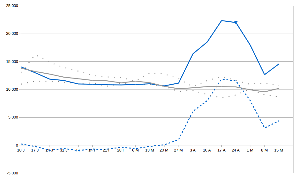
The solid blue line shows the deaths in England and Wales in 2020 and can be compared to the solid grey line which shows the five year average. Disappointingly, there seems to have been a rise in total deaths last week. I haven’t done any sums to see if this is statistically significant. Only time will tell if this is part of a new trend.
The total number of deaths remains about 74% higher than is being reported in the daily figures.
The dotted blue line is the number of excess deaths above the average.
The dotted grey lines show the max and min over the previous five years.
