
My weekly graph of the Office for National Statistics figures.
The solid blue line is the actual number of weekly deaths recorded in England and Wales in 2020.
The solid grey line is the average for the same weeks over the last five years.
The dotted blue line is the difference between the actual deaths and the average.
The dotted grey lines show the max and min weekly deaths over the previous five years.
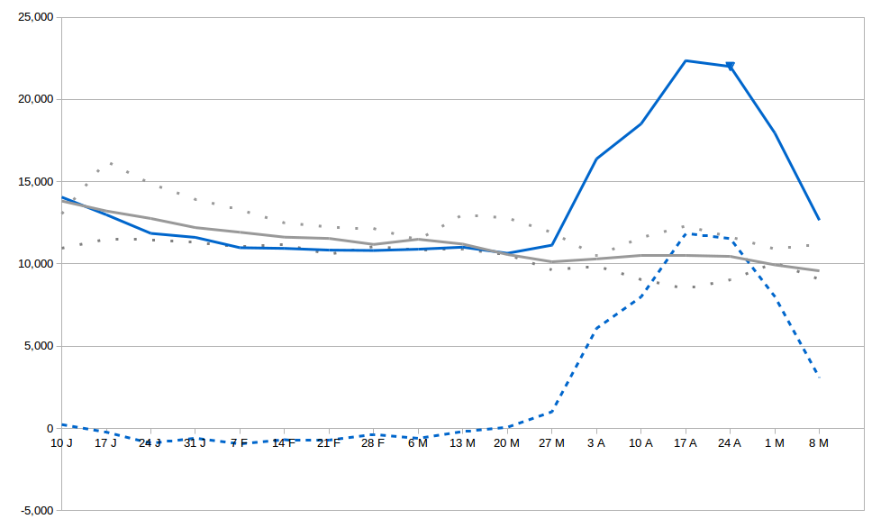
There have been approximately 54,600 excess deaths in the UK. The number of reported Covid-19 deaths up to 8 May, the same day that the graph ends, was approximately 31,500. So the reported deaths is still about 70% below the real number of deaths. Although this is actually much better accuracy than over the previous few weeks, where the corresponding figures were 80% and 86%.
The number of excess weekly deaths is now down to “only” about 3,000 in England and Wales. To put this in perspective, this is still three times the number of weekly deaths in the first week of lockdown. We’re certainly past the worst, but we can’t afford to be too cavalier in our attitudes.
If the figure of a 1% mortality rate for covid-19 is correct, then 50,000 deaths translates into 5 million people having been infected. That is still only 10% of the population – nowhere near enough to provide the UK population with herd immunity, even assuming that infection implies some level of immunity. The potential for a second wave is very real if we don’t proceed very carefully.
I’ll be having a virus test tomorrow to see if the sore throat I’ve had over the past week is virus related. Wish me luck!
