
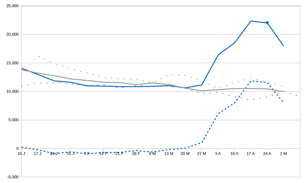
I’ve done a slight update on my previous graph to add the max and min number of weekly deaths over the previous five years (dotted grey lines). The idea is to provide some idea of the typical range of deaths in a given week. (The range between the mean and the max and min is not symmetrical because I’ve used raw figures rather than standard deviations.)
If you take the difference between the 2020 weekly deaths and the max of the corresponding week in the previous five years, then the number of excess deaths is reduced from about 46,500 to more like 40,200, which is still about 61% higher than was reported at the time, although not as high as the 86% that you get when you use the five year average as your benchmark. I think the 61% figure is extremely unlikely as 2020 was actually running below the average until the outbreak of the pandemic, but still, it gives some indication of the likely range and uncertainty in the figures.
The solid blue line is actual number of weekly deaths in 2020 in England and Wales.
The solid grey line is the 5 year average.
The dotted grey lines are the max and min from the same week in the previous 5 years.
The dotted blue line is the difference between the 2020 figure and 5 year average.

This is insane: packed commuters in the London Underground.
https://www.theguardian.com/world/2020/may/13/packed-tube-trains-prompt-union-anger-at-johnsons-back-to-work-message-coronavirus-lockdown
If we had the number of infections down to a manageable level (currently running at over 3,000 positives a day, and that’s only the minority that get tested), and had a proper test, trace and isolate infrastructure fully in place, then maybe packed London Underground carriages would be acceptable. But in the last seven weeks, the only thing that has changed is the ability of the NHS to handle more severely ill people. The virus hasn’t gone away.
The incompetence of the bunch of buffoons in the government is beyond belief. These poor commuters are like lambs to the slaughter.
LikeLike
‘The virus hasn’t gone away’. And it won’t, until we’ve got a vaccine (assuming the virus doesn’t mutate beyond our ability to control it), or until we’ve all had it (assuming that having had it confers immunity). The model that Birch drew our attention to this afternoon was illuminating, but it does depend on the values of the input variables. We simply don’t know enough about the damn thing to be confident what those are.
But it does seem clear that the elderly, and people with other health problems, are by far the most vulnerable; and young, fit people are most unlikely to be at serious risk. We have to protect the former while getting the economy in gear again. That is going to involve some risk; but so does everything in life. If people worried about, say, being involved in a serious driving accident to the same extent, nobody would get into a car again.
I am 70. I am fit and active, and I don’t feel vulnerable at all. But I accept what the stats say, and I am happy for my own freedom of action to continue to be curtailed if that means that I’m less likely to bother the NHS, and that my children and grandchildren can get back to something resembling normal life as soon as possible.
Cheers, anyway!
LikeLike